Project Brief
To design a mobile app using Figma and to implement the Apple iOS design style and guidelines for a civic improvement involving strengthening the social net, specifically food security in the United States of America.
Project Idea
Hunger and food insecurity have reached alarming levels, especially exacerbated by the COVID-19 pandemic, with profound implications for millions of households. In 2020, a staggering 14 million households found themselves unable to secure sufficient food to meet their basic needs (Pathak). This statistic alone underscores the dire situation faced by many Americans. Moreover, a more recent report from June 2022 reveals that the crisis continues to persist, with nearly 24 million households, including 11.6 million households with children, reporting that they sometimes or often lacked adequate food during the week (Pathak). These numbers indicate an alarming increase in food insecurity in our society.
Compounding these issues are the barriers that have only worsened the problem for individuals in need (Code For America). Cumbersome and frustrating application processes have dissuaded many from seeking assistance, perpetuating the cycle of food insecurity. Code For America identifies various obstacles that hinder individuals from accessing the aid they require, including misinformation, limited ease of access, and the fear of potential consequences.
In response to this pressing issue, there is a critical need for a streamlined and stress-free application process to connect individuals with the food aid they desperately require. An accessible and centralized platform is imperative to empower those facing food insecurity by providing them with a reliable and convenient means of finding and learning about food aid resources, both locally and nationally. Such a platform not only simplifies the application process but also demystifies it, reducing the stigma and fear associated with seeking help.
Ultimately, individuals living in poverty and experiencing food insecurity urgently require a centralized, accessible, and user-friendly solution that facilitates their access to vital food aid services. By addressing the barriers and complexities surrounding food assistance, we can make significant strides toward improving the quality of life for those who need it most and addressing the unprecedented challenges of hunger in our society.
What I worked on
Since this was a group project, I contributed in ways that helped with the collaboration and completion of the app. I developed sketches on how I envisioned the app to look like, which appealed to my teammates. We all chose to work on a specific feature and I chose to work on one that helps users sign up for the SNAP form. We hopped on a website called Figjam and created a flowchart together, I added mine to represent how I wanted the form feature to work. I would create and start documents for my group such as the competitive analysis, project proposal, and UX before/after deck. I would be asking questions on the direction of the project and providing potential ideas for the design.
Design Research
When we were brainstorming ideas on how we wanted the design to look like, I scouted through different apps on my phone and found inspiration from the social media platform Instagram. I decide to reflect my sketches on this app with the vision to be used as a food bank resource. I thought about creating a newsfeed for foodbank providers, a map to find food resources, a recipe page to create cheap home meals, and an application sign up feature. It felt a bit ambitious to some group members, so we scrapped the newsfeed and simplified some elements.
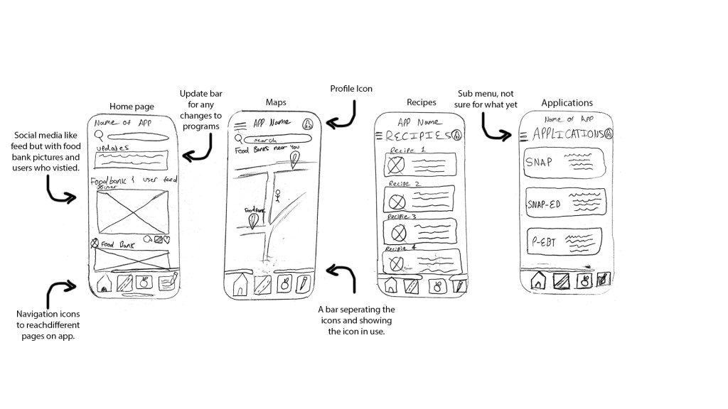
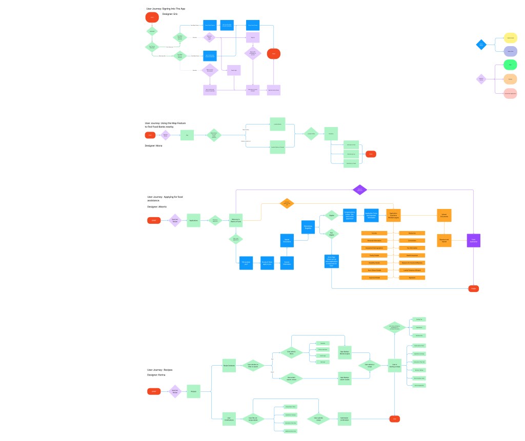
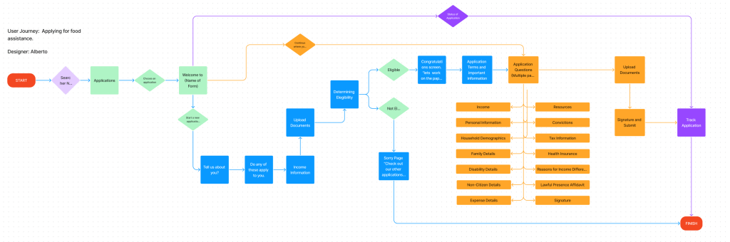
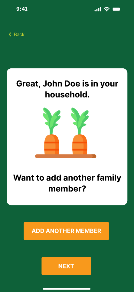
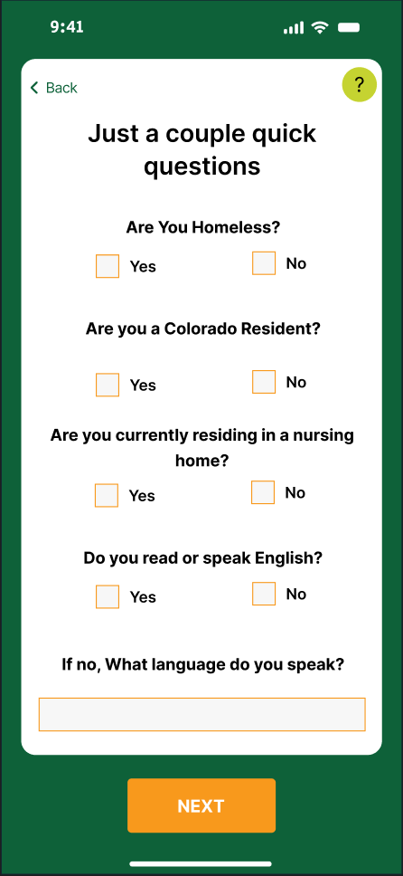
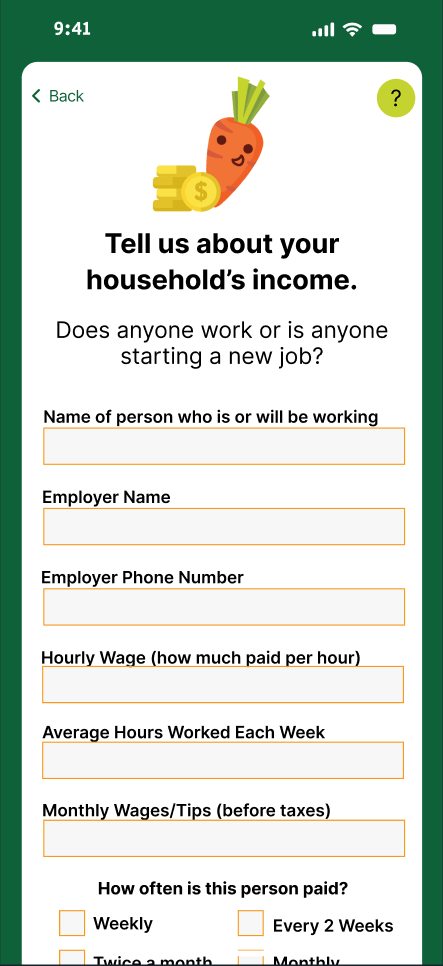
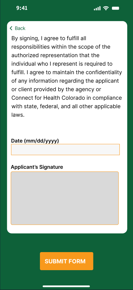
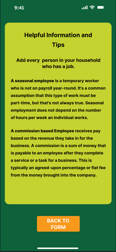
The flowchart was a combination of all of our respected features. We used this for the startup sign up process, map, recipes and application features. The entire flowchart ended up being huge making it a little hard to read. My section in the chart focused on how I wanted the application feature to work. It would welcome the user to the form and ask some questions about them to determine their eligibility. Then it would streamline simple worded questions asked by the actual governmental form to make it easier for the user to complete it. I also had ideas to make it able for the user to save their progress or check on the status of it.
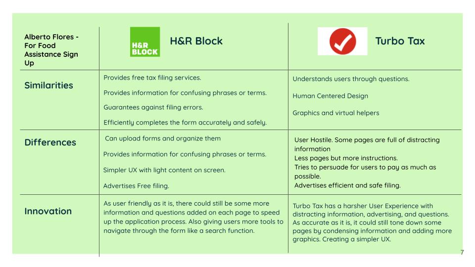
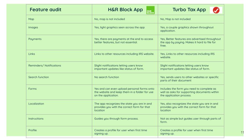
For the competitive analysis, I decided to focus on the two tax filing applications known as H&R Block and Turbotax. I compared their differences, similarities and things they could improve. I found that H&R Block makes it easier for the user to file taxes, but Turbotax is more efficient and accurate. We also created a feature audit to compare every app we chose for the entire app and looked for features like maps, payments, forms, and more.
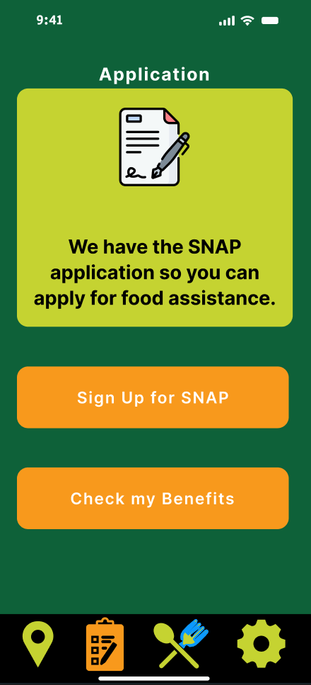
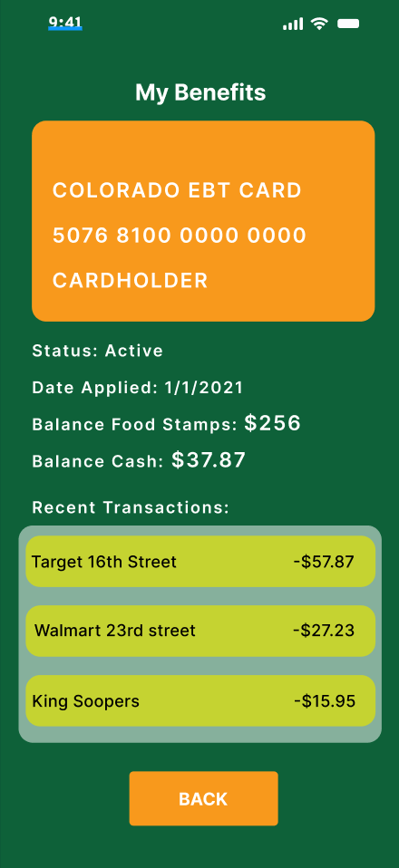
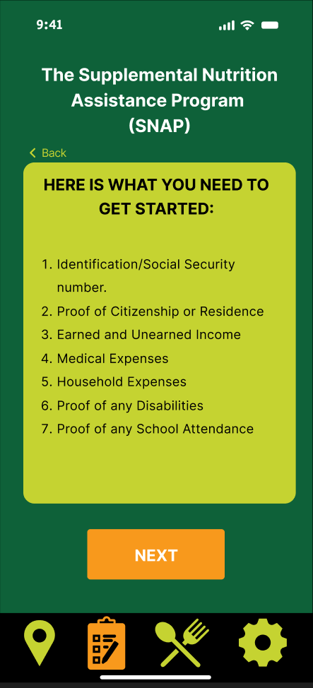
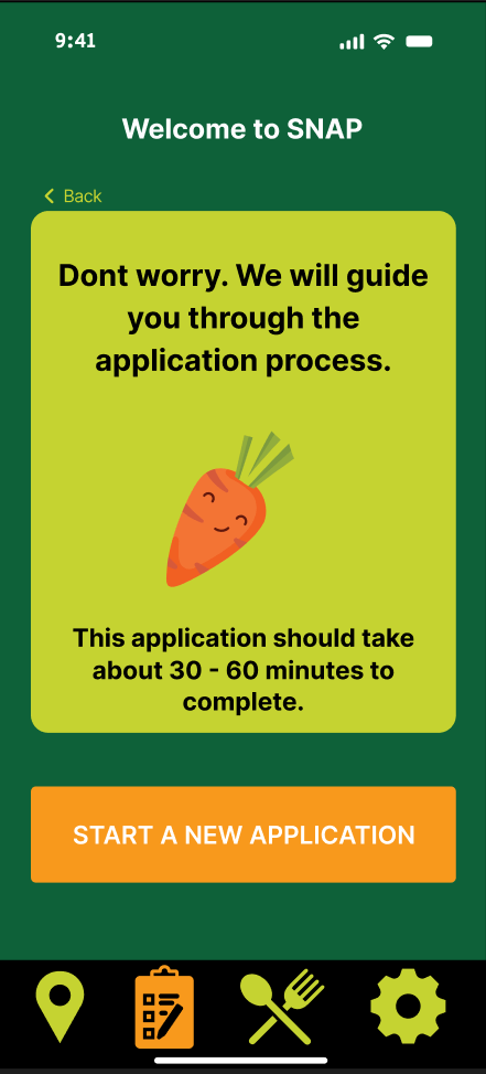
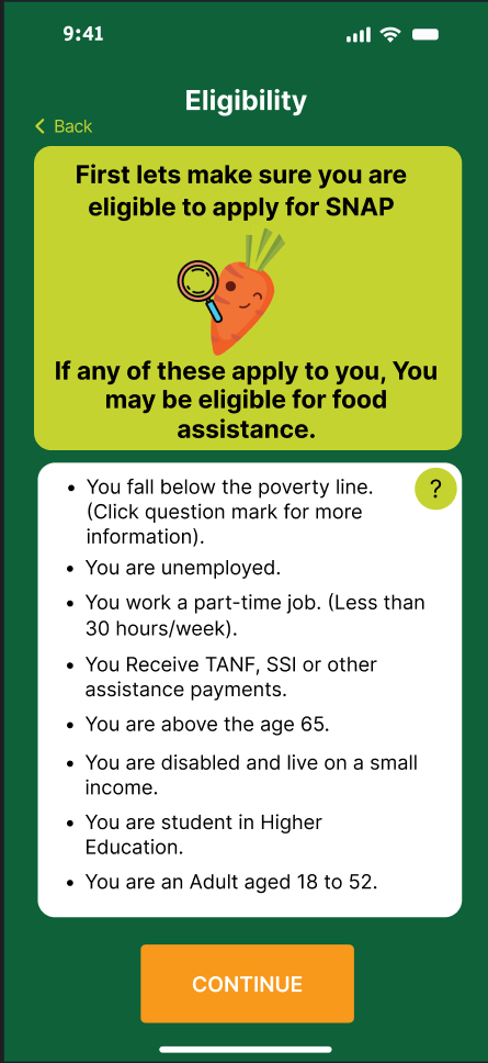
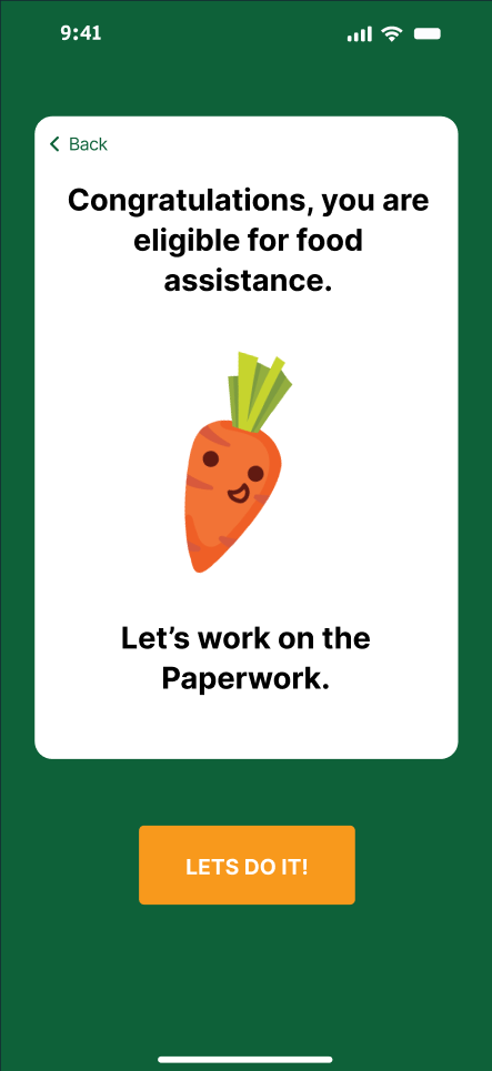
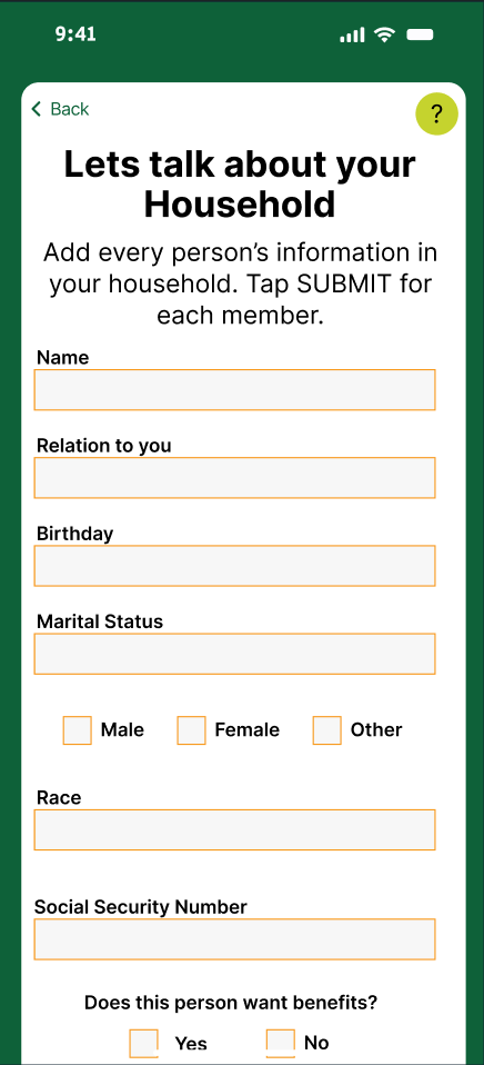
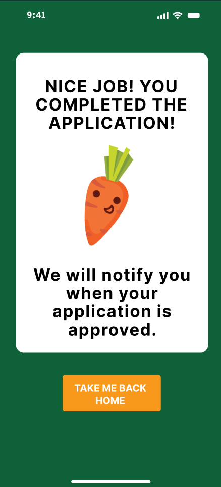
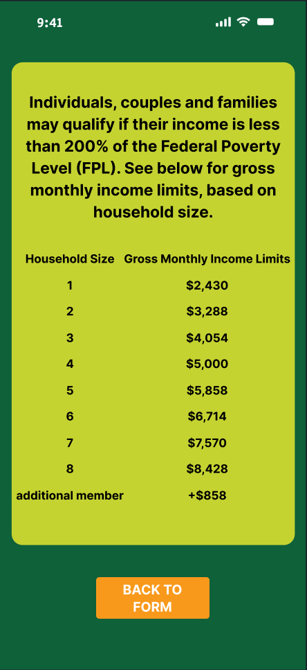
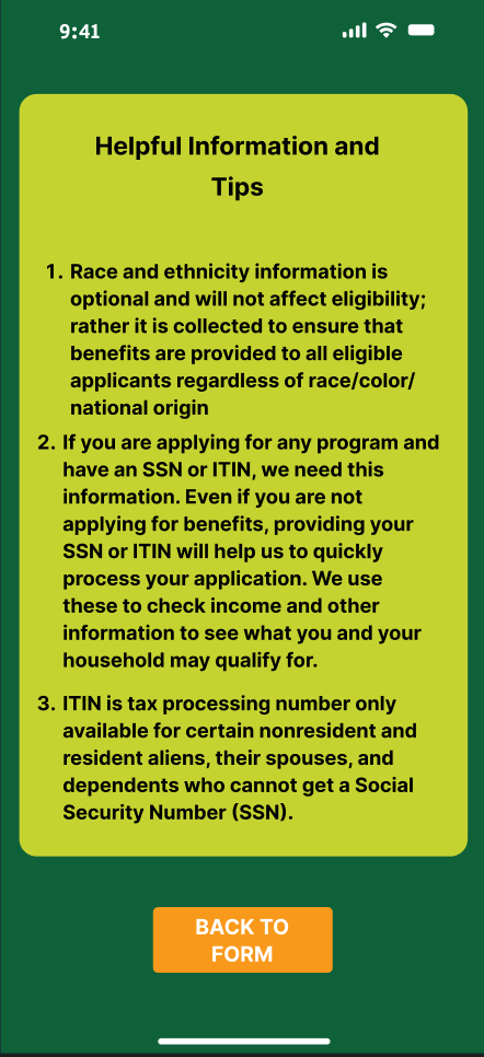
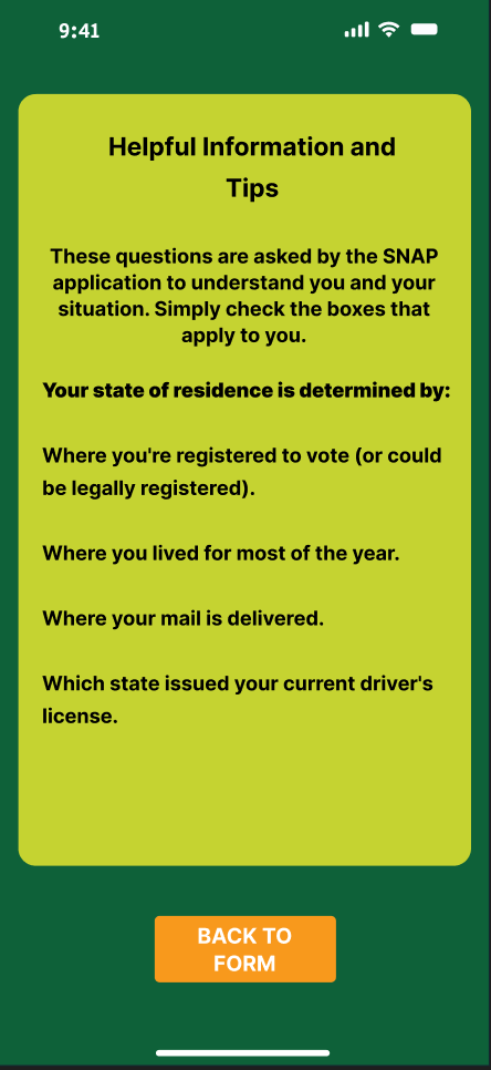
SNAP form sign up screens
Usability research findings
We ran an unmoderated remote usability test using Trymata to survey 5 random participants on the user experience of our app. Each of these participants completed 9 tasks and answered our questions involving their experience. Out of the 5 participant tests, we got 4 good data results. This is because one user experienced technical difficulties trying to access the link which held the prototype.
Most users found that the color palette didn’t contrast well, and that the buttons were inconsistent between different screens in terms of their design and placement. One user reported that the green made the app look inconsistent against the orange and blue colors used. So we created an entirely different color palette, which I wasn’t too happy with, but it did make it feel more cohesive. There are several different designs for the same button function. For example, the “Back” button which looked different in certain screens of the app. There also needed to be a dedicated place for the settings button. Lastly, some people didn’t understand the purpose of the recipe page. So we worked on making it clear that it’s meant to cook home meals. These issues were resolved first as our top priority as we still had some more feedback that don’t require as much attention.
We found some other interesting qualitative findings when reflecting on our user testing. We found that 2 out of 5 participants found the navigation bar icons difficult to understand, while 1 out of 5 found them intuitive. We reworked the navigation bar to reflect these findings.
We were surprised to find that 2 out of 5 participants found the colors to be cohesive. However we still needed to rework it entirely as it wasnt super successful.
We received qualitative quotes from a user named Paulina R saying “I’m content with this layout” and it “looks very nice and clear in my opinion.” We appreciated these quotes as it made us more confident in our design.
Usability research videos
Prototype video walkthrough
Sources
Pathak, A., Schweitzer, J., Jordan, A., Ross, K., Banks, L., & Kogan, B. (2022, November 4). The United States can end hunger and food insecurity for millions of people. Center for American Progress. https://www.americanprogress.org/article/the-united-states-can-end-hunger-and-food-insecurity-for-millions-of-people/
Hunger and poverty in America. Feeding America. (n.d.). https://www.feedingamerica.org/hunger-in-america/poverty
Haynes Stein, A. (2022). Barriers to access: The unencumbered client in Private Food Assistance. Social Currents, 10(3), 207–224. https://doi.org/10.1177/23294965221129572
Supplemental Nutrition Assistance Program (SNAP) https://cdhs.colorado.gov/snap
