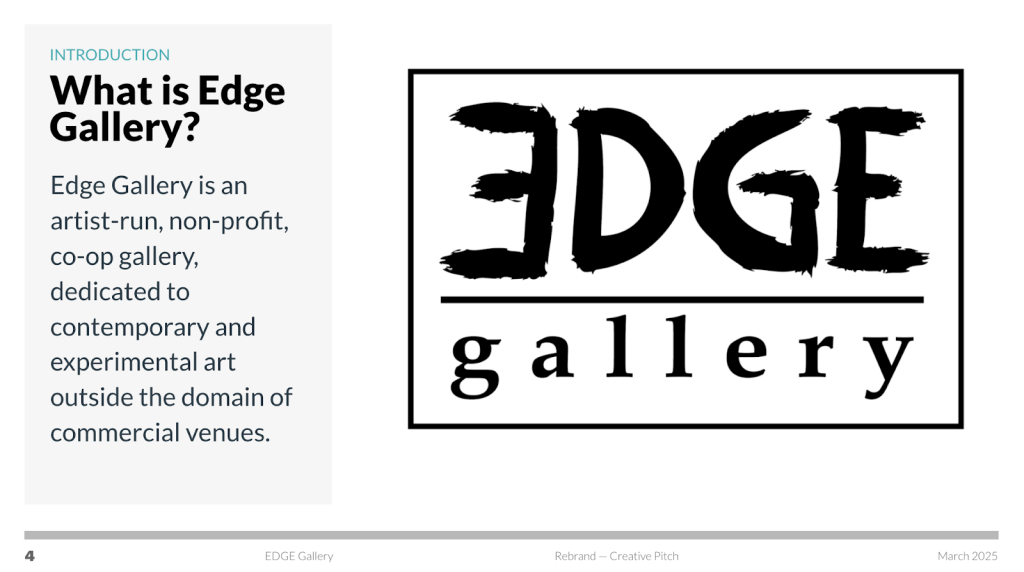
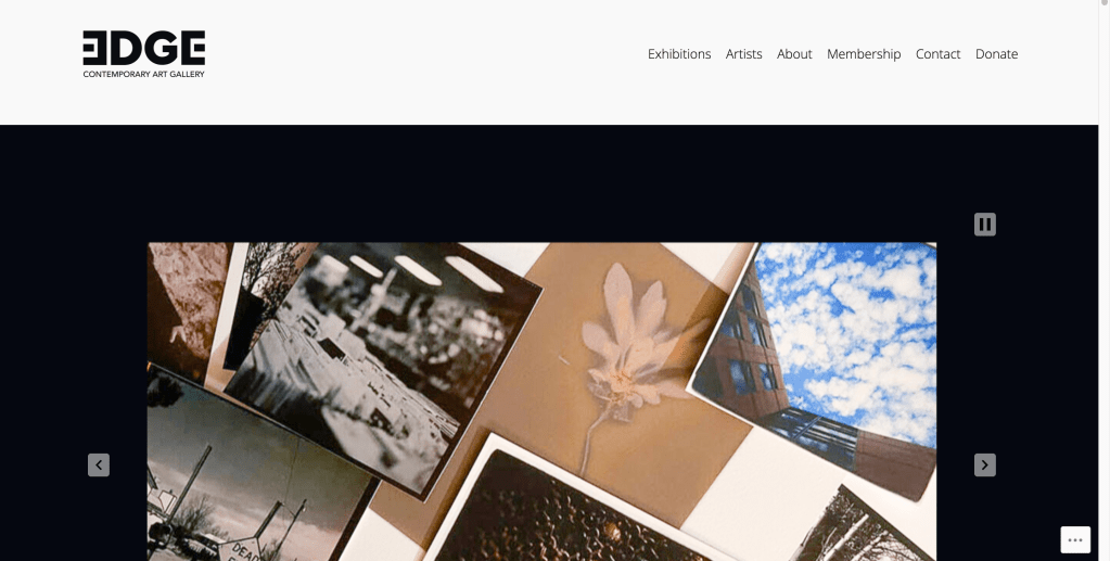
I worked on a collaborative project to create a rebrand for a small art gallery in Lakewood Colorado. I was tasked with creating a concept for their new website. I did lots of research and a comparative analysis to create a new website that helped the gallery stand out from the competition.
Overview of My Contribution
I, Alberto Flores, contributed by exploring Edge Gallery’s mission, vision, and values statements. I researched other galleries in Downtown Denver starting with the most popular such as Meow Wolf to the non-profits like Redline Contemporary Art Center. When it came to creating our first pitch presentation, I developed slides and proposed new logos, colors, typography, and messaging for the gallery’s rebrand. After we received the decisions from the clients, I refined the logo they chose and displayed it on our revised proposal. After hearing their response, I began to research potential website hosting providers they could switch to later on depending on their budget. Since they wanted to stick with a free website, I ended up choosing WordPress.com. I then developed a redesigned website with a cleaner and modern style that fits well with the brand’s new identity. When we worked on the brand style guide, I helped by creating the logo guidelines and structuring some slides for the presentation. I actively communicated and collaborated effectively with my teammates and brought up suggestions, concerns, and questions throughout the entire process.
My Original Concept
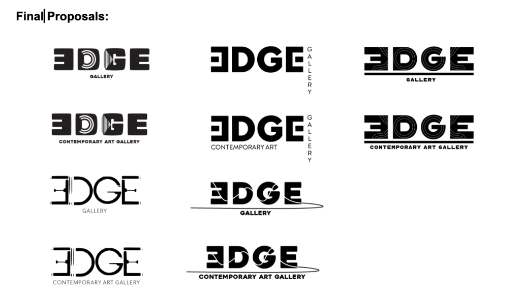
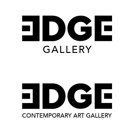
Logo: When developing 5 potential logos, I played around with symbols and patterns. I merged them with different typefaces to create unique and contemporary logos. I also wanted it to feel modern with a recognizable appearance that made it stand out from the galleries featured in the 40 West Arts Hub. I wasn’t happy with two of my concepts so I decided to scrap them and create two new ones. Before I did that, I went to the art gallery to take notes and see if anything stood out to me. I found the art gallery to be very small, but its layout felt impactful with its presentation of artworks. I used these findings to create a new logo that mimicked the floor plan layout of the gallery while also keeping that contemporary and modern feel to it. This concept felt the strongest to me because it resembled the gallery’s usual layout. This new logo also captured that modern and contemporary feeling I was looking for. The only weakness to this concept was the subtext “Gallery” which I positioned in a hotel lettering style that did not look very good. Surprisingly, the client selected to use my logo and made a modification that fixed my hotel lettering issue. They told us that the board members all agreed to use this logo because it reflects the gallery well and displays a significant rebrand.
Colors: The colors I proposed were based on the warm brown colors that I saw when I visited the gallery. I felt like a light and dark brown would bring in a comfortable feeling to viewers when looking at the logo. I also proposed an orange color just for fun to see if they would be interested in it. However, my proposed colors were not chosen possibly due to their weakness in creating a bold effect. I chose bland colors, when my teammates had better and pleasing options overall.
Typography: The typefaces I proposed felt like strong contenders, but were not chosen because my other team members provided better and more inclusive options. My idea was for a sharper looking typeface while Mikeala’s option was easier to read and digest. I believe the main weakness was my reasoning for choosing this typeface as I only explained to the client that its appearance gives it a sleek and sharp feel to the brand. Mikeala pointed out that her typeface has been known to be a great accessibility option for people with dyslexia and other conditions.
Messaging: I created new mission, vision, and values statements for the gallery by doing more research on its rich history and past exhibitions. I also tried my best to stay somewhat close to their original messaging. However, I struggled with this concept because I could not come up with a compelling mission and vision statement. I just reworded and found synonyms of their original statement and tried to create something fresh. It felt pretty weak and wasn’t chosen by the clients. However, they did choose one of my key values for the brand.
Choosing the Final Aesthetic
Mikaela, our team lead, communicated with our clients through email for the entire process. We helped Mikeala draft and proofread some of the emails, and she would send them out when we all felt confident enough to do so. Any questions we had would be brought up to Mikeala so that she could include it in the emails. The clients would try their best to answer our questions by replying to those emails as soon as they could. There was an instance where our clients took a long time to respond, making me feel worried. So I communicated to Mikaela if we could send a follow up email to make sure things were still on track with the client’s decision making. Mikeala was always friendly and professional in her emails and formatted them so that they were easy to understand and respond to.
Throughout our design process, we met up with our two clients in person multiple times. The first time was to present our earliest proposal. They were impressed with our presentation and showed it to their board of members during one of their monthly meetings. After they received feedback from most of the members, one of our clients, Travis, got back to us with a physical copy of our presentation. It displayed the choices they made all together. He told us that the board was happy with the logo I created, but that they wanted a small modification to the subtext. He also liked the colors Mikeala and Ethan proposed and wondered if we could create logo mockups as they were not sure about colors yet. He told us that Mikaela’s typography proposal of using Avenir would work best for them. Finally, he brought up the brand messaging which he needed our help to choose the best words to represent their new values. With these selections, we were able to revise a new proposal with mockups and better color options. This was the point where they took a little long to respond, so we moved onto the next stages of our process which was the website and deliverables. I had an abundance of questions about their current website hosting, domain information, and budget on top of the questions from my teammates. We sent this big email, and Travis asked us if we were able to have a small meeting in order to answer all these questions. This helped us immensely and we were able to start working on our deliverables and style guide. Once we got that all done, we met up again with our two clients and showed them our entire design rebrand package and style guide for their final feedback. They suggested only minor modifications on the website as well as other deliverables. So I got to work on that and sent them access to their new website so that they can use it down the road if they choose to do so. They asked us to provide our contact information in case they may need us in the future.
Overall, our clients were very transparent with us and their decisions. We gave them options and they chose their favorite ones with suggestions to make them more appealing to them. We were very friendly and communicative throughout the entire process. I believe if we wanted to form a stronger relationship with them, we could have visited the gallery more often.
Roles
While Mikaela was overall the team leader in the project, I was the second in command in case she was not available. I recommended using Telegram as a way to quickly communicate with each other and would bring up questions and confirm choices we made. Ethan was following our lead, being very supportive towards our choices and planning strategies. We all worked very hard to create everything we needed for this design package. Mikeala started a Trello board which helped us stay accountable with deadlines and things needing to be accomplished. We would often break down parts of the project into pieces and assign them each to everyone in the group. We did this for the research, the presentations, the style guide, and the deliverables. I was tasked with creating the website, while Mikeala did the social brand strategy and graphic templates, and Ethan with the printed media and publication information. We would often help each other and critique each other’s work to make sure the designs were top notch and ready.
Challenges
Overall, this project was a smooth and easy process. However, we still ran into some bumps on the road when it came to sending our design files and deciding on color. After our revised proposal, Travis asked if we could send him the files of our logo. I looked up a video on Youtube and followed it so I could send the files properly. However, I was a bit confused when I messed up the CMYK files as they were being exported with wonky colors and in an RGB format. I communicated this with Mikeala and she didn’t really know what I was doing wrong, but she tried her best to help. She sent me a link to a website and other resources that helped me realize what I was doing wrong. We also consulted our professor for the right file types to use when using CMYK and RGB which helped clear up that confusion.
We ran into an issue where we chose a black color that may have become a problem when it came to printing. We consulted our professor and she informed us that the black color we chose may bleed through the paper due to its CMYK values. At first I was frustrated because I did not understand what she meant by that. However, I did more research and printed out different variations of the color black to spot what she was talking about. We as a group began to understand and composed a new black color with a blue tint that we could successfully justify for the gallery rebrand.
I felt very confused at times, but I would often ask many questions to my teammates and my professor to make sure I completely understood what I needed to be doing.
Experiences
This whole project was a valuable learning experience for me as I have never worked with a team of designers to satisfy client needs from a real organization. I learned how to work collaboratively with other designers from different backgrounds and skill sets. I also considered my own strengths to determine how I can be most useful during the design process. I was very supportive with decisions and got along with my teammates very well. I also practiced making suggestions and providing critique towards my peers effectively and respectfully. But the most improved aspect from myself was communication. I consider myself to be a bad communicator, but this project helped me recognize that my speaking skills have improved. I feel more confident now when talking to people than I was before. The only thing I would do differently is manage my time better as there were instances where I still procrastinated. The most successful aspect of our project was our collaboration as a team. We never had any big issues with each other, and when we had questions or concerns, we would quickly try our best to resolve them together. We all had respect for each other and kept our different skill sets in mind to divide work evenly. I don’t really feel like we failed at anything which made this experience very smooth and easy for us. I find it valuable because it helped me recognize that making it easy for everyone involved in the process is what I need to continue doing when working with future clients. I feel proud of myself and how much work and dedication I put towards this project. I am also very happy that the gallery ended up choosing my logo idea which helped with my confidence as a designer overall. This learning experience has been extremely valuable for me and I will never forget it as it will be the basis for all my future experiences.
